Fiserv Zelle Integration
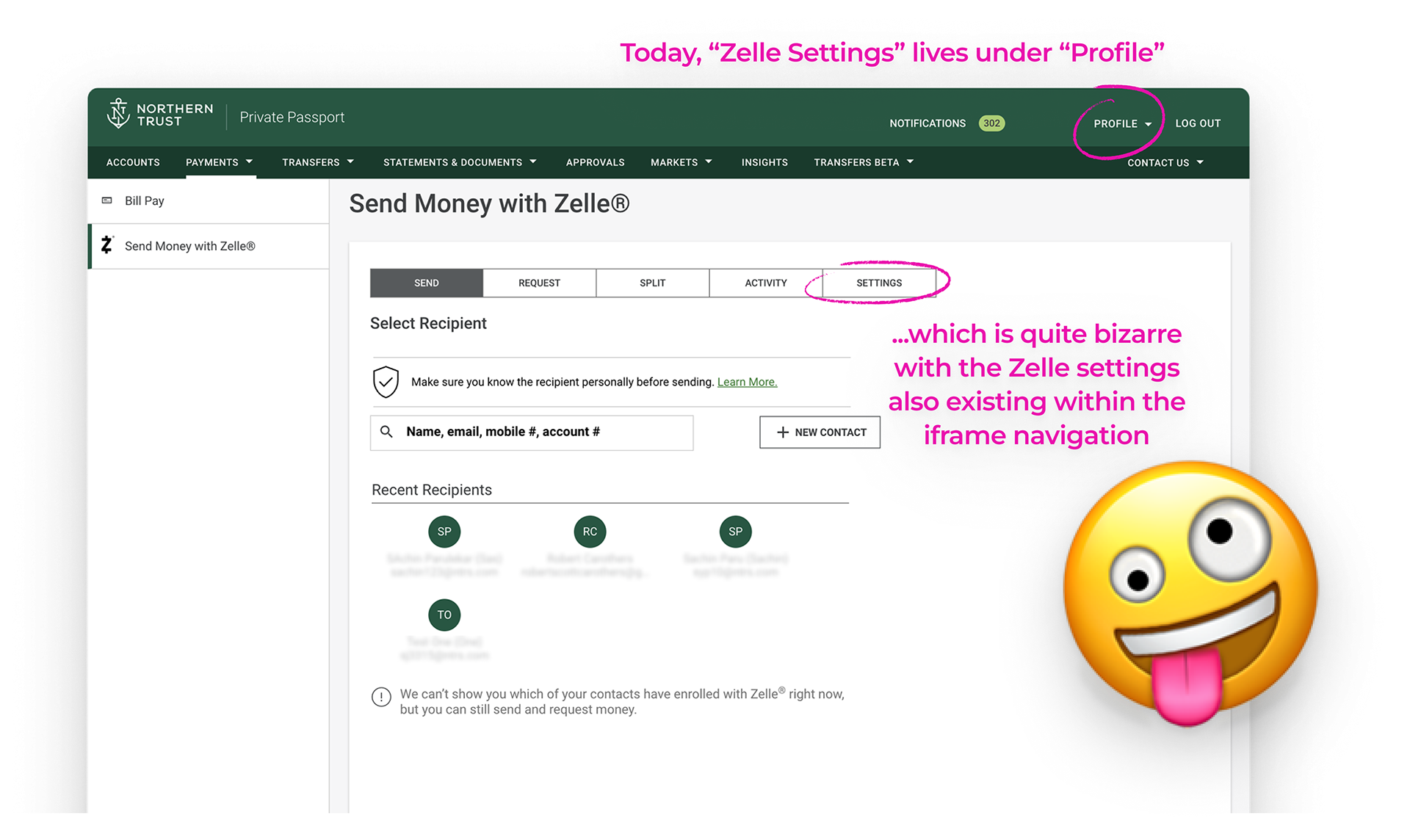
Integrating Zelle into the P2NxT design system was a critical step toward maintaining consistency and brand integrity across Northern Trust’s digital ecosystem. Unfortunately, much of the existing experience relied heavily on iframes—Zelle in an iframe, bill pay in an iframe, debit card management in an iframe. Nearly every third-party integration lived inside a box, creating a fragmented and visually disjointed experience for clients who expect more from a global private bank.
The concept shown below demonstrates how the experience could look if Northern Trust invested in cohesive, design-led solutions instead of stop-gap containers. This exploration wasn’t just about Zelle; it was about proving the value of UX as a strategic differentiator—and highlighting the widening gap between what’s easiest for engineers to implement and what clients actually need. These are some of the wealthiest clients on the planet. They deserve better.
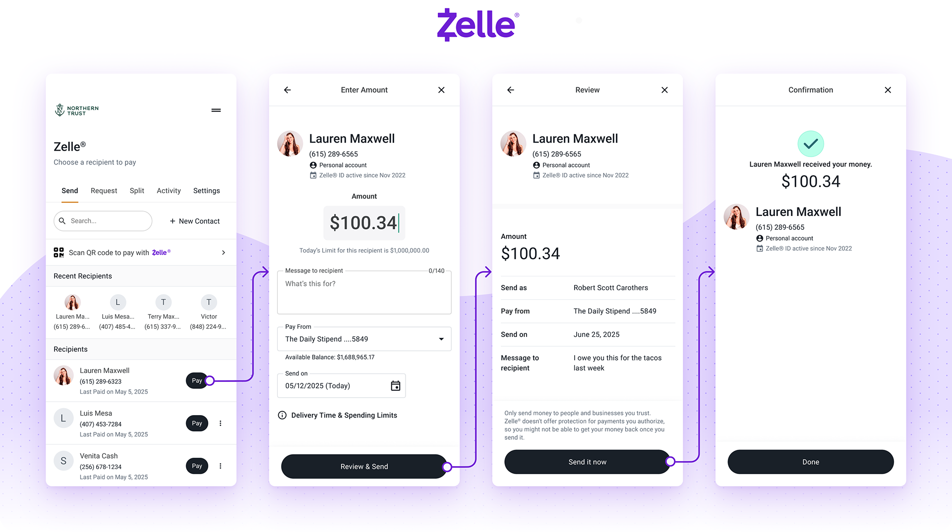
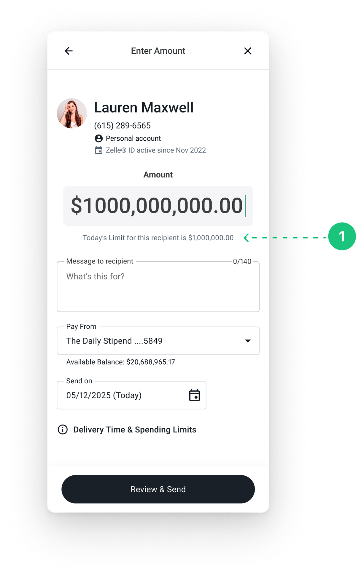
Display Daily Limits
Northern Trust clients frequently expressed the need for higher daily Zelle limits in customer success surveys. This concept explores how we could address that feedback through clearer visibility and improved communication of available limits.
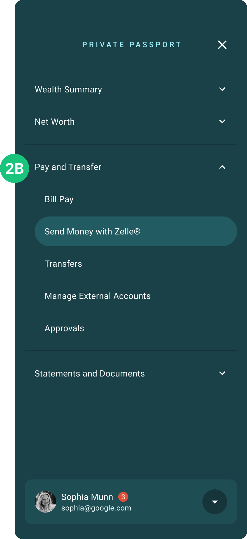
Desktop Navigation Improvement
We consolidated all Money Movement features—including Zelle—under “Pay and Transfer,” replacing the scattered navigation and cumbersome iframe flow with a clearer, more cohesive experience.
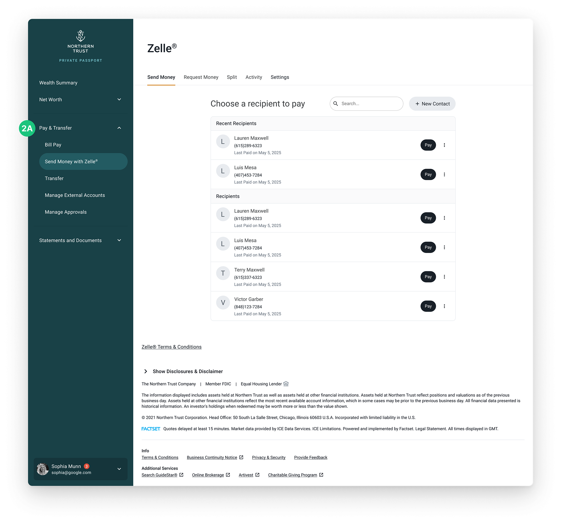
Consistent Wayfinding Across Platforms
For Zelle, this change improves wayfinding by making access more direct and visible—addressing common pain points like the one below:
“Why is Zelle buried three websites in? Put it on a landing page for easy access. If I’m on mobile, that’s likely what I’m looking for.”
The Solution they've settled with today 😂
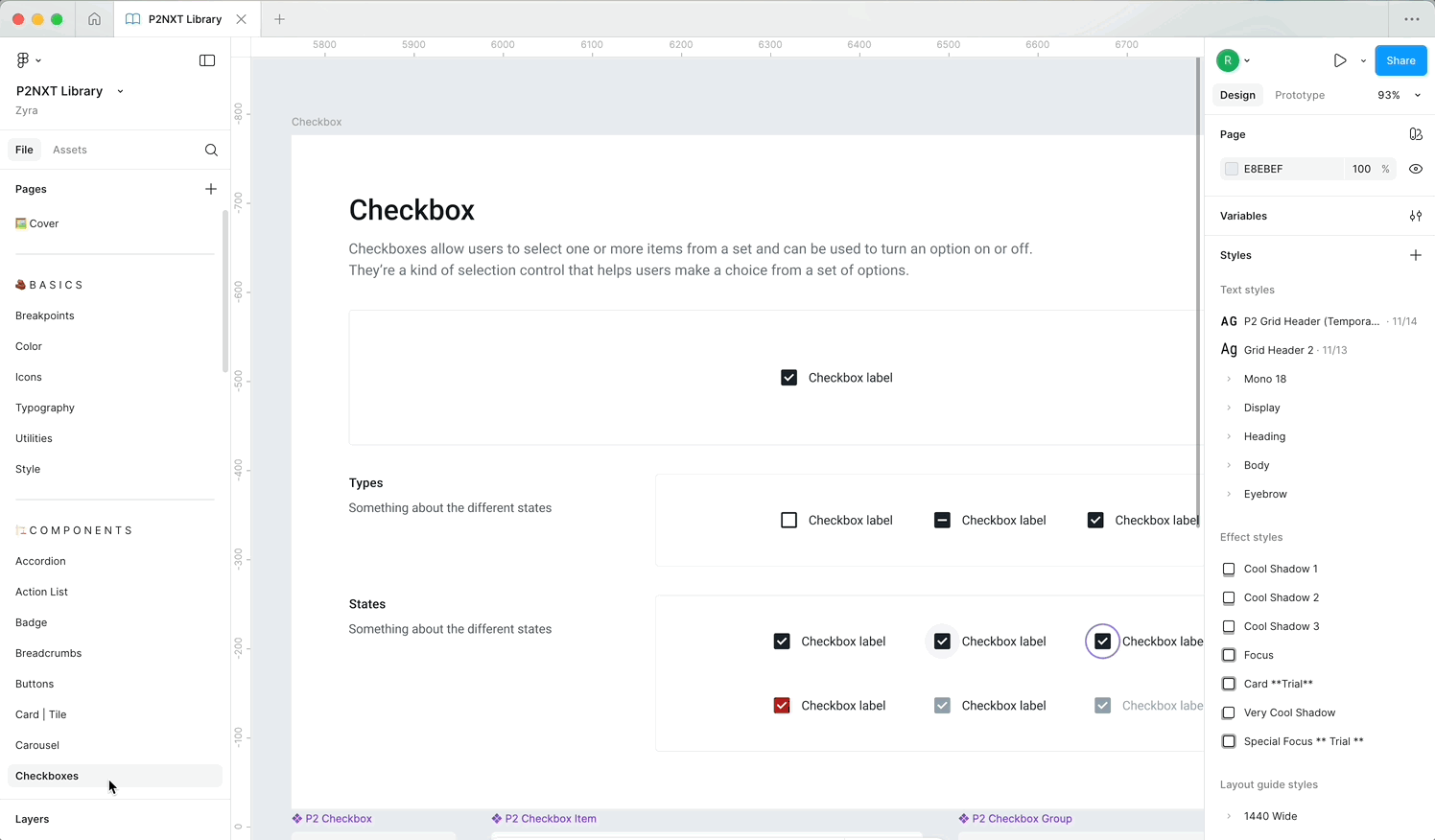
the Design System
This is just a glimpse of the building blocks that we used and refined to make our products shine.
Hey, that rhymes. It's called P2NxT.
Hey, that rhymes. It's called P2NxT.