Novartis, Design System
for health care provider drug websites
Context Switching Component
(also known as the “Multi-Indication” component)
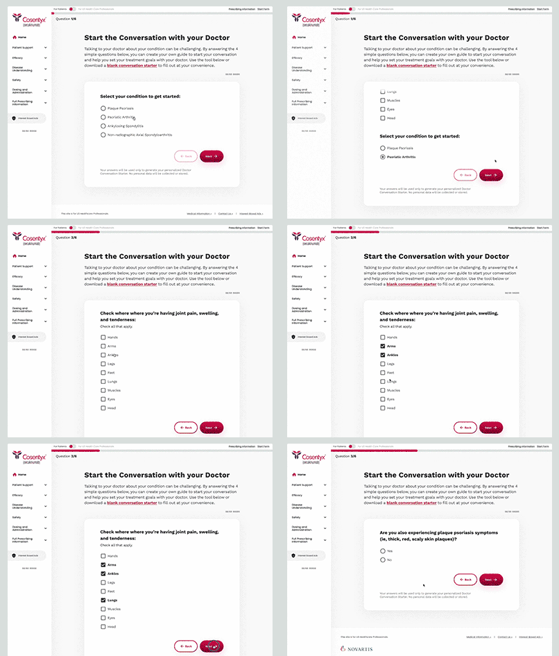
We developed this component to address the extensive parallel information across different diseases on drug websites. For instance, if a doctor is reviewing the efficacy data for Disease A, they can seamlessly switch to Disease B to compare efficacy in an instant.
Ideation Refinements from Testing
During testing, we validated the need for the web content “context switcher” for HCPs, but it wasn’t easily findable until we increased the contrast from the previous example.
Below is the refined version of the component from our library, along with its multiple variations.
Navigation
During my time on this project, I enhanced the global navigation on the left rail. The Figma embed below showcases the brand-neutral, accordion-style navigation structure we implemented.
Opportunities
On desktop, the navigation obscured page content when users hovered over it, and it did not indicate what page the user was currently on. Additionally, the top-level navigation failed to show that items were nested beneath the sections, and the icons next to each navigation label made some HCPs feel like they were on a marketing website. On mobile, some users didn’t understand how to expose more menu items on the scrolling bottom navigation.
Solution
Opportunity 1
The icons next to each navigation label made some HCPs feel like they were on a marketing website
Solution 1
We made icons optional, reducing visual noise and providing less of a marketing-centric aesthetic.
Opportunity 2
The top-level navigation did not indicate that items were nested beneath the sections*
Solution 2
We added a downward-pointing carrot to indicate that there were additional navigation items on both desktop and mobile.
Opportunity 3
The navigation did not indicate what page the user was currently on*
Solution 3
We bolded the link that corresponds with the page the user is actively viewing.
Opportunity 4
On desktop, the navigation obscured page content when users hovered over it
Solution 4
We expanded sub-navigation items in-line with accordions.
Opportunity 5
On mobile, some users didn’t understand how to expose more menu items on the scrolling bottom navigation
Solution 5
We redesigned the mobile navigation (reminiscent of a native iOS app) and implemented a more classic-to-web hamburger menu.
Success!
When we tested the proposed navigation design enhancements, we saw major improvements.
While some of those improvements came from link title changes and the order in which we displayed those navigation options, we saw that users were more easily able to navigate after eliminating icons and expanding navigation panels.
These changes made way-finding more straightforward, resulting in the new and improved Navigation Option Two which was released in version 1.1.0. It has undoubtedly provided a trustworthy and approachable navigation construct for both our HCP and patient users.
These changes made way-finding more straightforward, resulting in the new and improved Navigation Option Two which was released in version 1.1.0. It has undoubtedly provided a trustworthy and approachable navigation construct for both our HCP and patient users.
